


Is your messaging the problem?
Send us your URL. We'll review what's working, what's not, and what's costing you conversions.
Start the convo
Send us your URL. We'll review what's working, what's not, and what's costing you conversions.
Strong messaging should always come before design. Visitors decide in seconds whether they understand what you do, and no amount of design polish keeps them around if the words don't land. When we nail the messaging first, design outcomes improve and quicken, and conversion improves after launch.
When building a website, it's natural to focus on design first because it catches the eye and is often where teams jump in. But what we've found through experience is this: a beautiful site with unclear messaging often ends up being a pretty waste of budget. If visitors don't quickly understand what you do and why it matters, design alone won't keep them around. Clear, strong messaging is what turns curiosity into clarity and browsers into buyers.
When we say "messaging," we're talking about the core ideas and language that explain what you do, who it's for, and why it matters. This includes:
Messaging isn't about jargon or slogans, it's about clarity and connection. The goal is to make your visitor say, "Oh, this is for me," within the first few seconds.
Starting with messaging has been key to our success, and here's why it sets the foundation for everything else:
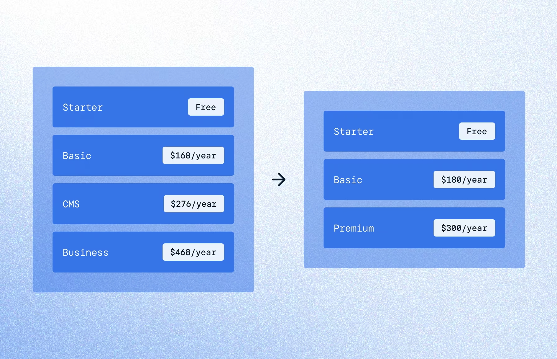
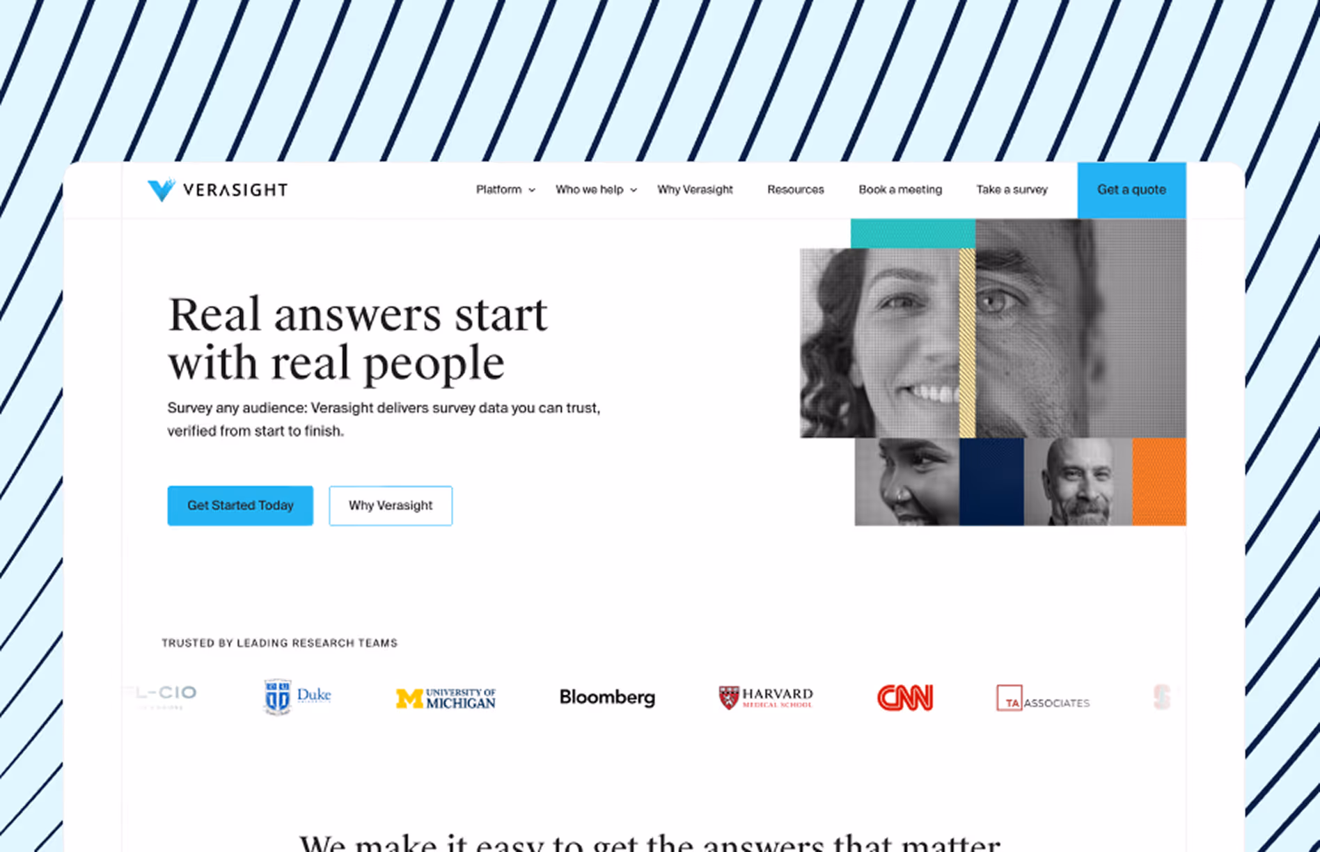
When we kicked off Verasight's website, we didn't jump into layouts or colors or fancy interactions. We paused, stepped back, and focused on one thing: getting the message right. Without a strong story, all you've got is a pretty mess. Once we nailed what they do, who it's for, and why it matters, the rest flowed naturally after that.
Before messaging:
Everyone had great ideas, which meant finding alignment took time. Progress was steady, but design kept shifting as we figured out the message.
After messaging:
Messaging gave the whole project a spine. It kept the team aligned, the copy focused, and the design intentional. When the story's clear, everything else clicks.

We've also seen what happens when messaging gets skipped. A company pours time and money into a beautiful site. Animations are slick. Pages are polished. But a month after launch, results are underwhelming. Traffic's fine. But conversions? Crickets.
It's not a design problem. Without a clear message, the site doesn't feel like it's for anyone. It also gives sales nothing to lean on, which is why we always start with aligning the site to the sales team's needs. Design might open the door, but it's the message that invites people in.
Q: What if I'm still figuring out my messaging?
A: Totally fair and super common. Messaging is a work in progress for most teams. The important thing is to start with what you do know about your audience and the value you bring. Use what you have (customer convos, competitor insights, team brainstorms) to shape a first draft. Then tweak and refine as you learn more.
Q: What if our messaging changes after the site is designed?
A: It happens! Ideally, messaging drives design from the start. (Heading into a redesign? Our prep guide walks through how to lock in messaging before the first mockup.) But if things evolve later (and they often do), it's worth adjusting the design too so everything still works together. Great sites aren't static, they grow with your business.
Q: Isn't design what really makes a first impression?
A: Sure, design grabs attention, but messaging keeps it. People might land on your site because it looks good, but they'll stay (or bounce) based on whether they get what you do right away.
Q: How do I make messaging clear and creative?
A: You don't have to choose. Clear messaging just means your audience understands you. Creativity comes in with how you say it — tone, storytelling, visuals. Think of messaging as the blueprint and creativity as the flair you layer on top.
We've found that the most effective websites lead with a clear, compelling message. When the story is strong, design, UX, and conversions all improve. A beautiful site is great, but a site that communicates clearly is what actually works.
We'd love to take a look through your messaging and positioning, and see if we can help with a website redesign. Reach out below, or find us at projects@crew.dev.